Data Visualisation: engaging others with your research
Posted on: 15 March 2024 by Dr. Mhairi Towler (Number of words: 370; Read time: 1 minute, 51 seconds) in Blog posts

Dr. Mhairi Towler, Founder and Director of the animation production company, Vivomotion, discusses how researchers can visualise their findings for any audience.
As a researcher, you will produce data. The data might be numbers, words, images, or a mix of these. But how do we interpret the data to define meaning and present the findings to a given audience? It is a challenge...
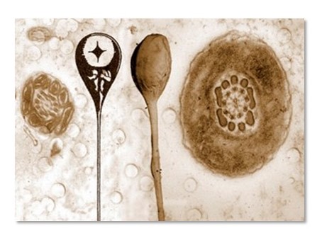
My name is Dr. Mhairi Towler and I started my career as a researcher in life sciences. Most of the data I produced were images of cells. I was lucky enough to collaborate with an artist to help make an impact with my data, by looking at the data through a different lens, not a microscope, but by creating a series of screenprints. This helped me to broaden my horizons and think about other ways to present my data to reach a new audience, not necessarily a scientific one.
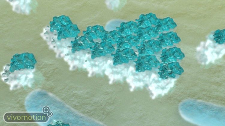
This project led me to explore diverse ways to visualise data, and animation piqued my interest as one way to do this. I re-trained in animation and visualisation and set up a business Vivomotion, to help scientists convey their concepts to various audiences using animation and graphics.
The workshop I will be running on data visualisation as part of the, Making an Impact 2024 programme at The University of Liverpool, serves as an introduction to the massive field of data visualisation. Regardless of what discipline you work in, the workshop content is for you. Good visual storytelling will feature, to help an audience understand data, and design principles will be covered to illustrate how to make a visual impact. Creativity techniques will be shared, as well as examples of data visualisation highlighted for inspiration.
If you would like to hone your practical design skills, discover new tools, and delve into how to create compelling visual stories with your own data sets, do come along to the online session on Thursday 13th June from 9.30 a.m. - 12.30 p.m. (https://MAI24DataVisualisation.eventbrite.co.uk). I look forward to collaborating with you to develop the visual impact of your data.
Feedback from a previous participant, ‘I never expected that data visualisation was this deep. I am now open to another world of the importance of representing my data for a layperson to understand and interact with. I am inspired.’
About the author
Mhairi Towler integrates a background in science with animation skills to use visuals to communicate science to a wide audience. Mhairi earned a Biochemistry degree and a PhD in Molecular and Cell Biology from the University of Dundee. She carried out postdoctoral work, both in San Francisco and Dundee. She was a founder member and Co-chair of the College of Life Sciences Postdoctoral Association. During her time as a postdoc, she also completed a postgraduate certificate in teaching and learning in higher education and recognised the importance of the visual as a cognitive tool. She completed a Masters in Animation and Visualisation at Duncan of Jordanstone College of Art and Design at the University of Dundee in 2012 to become a scientific visualisation practitioner.
Mhairi is the Founder and Director of the multi-award-winning animation production company, Vivomotion (www.vivomotion.co.uk). The company offers a service of bespoke animations for scientific communication as well as training workshops for postgraduate researchers and academic staff on the visual communication of research. She hosts the podcast ‘Opportunities in Science’, which highlights career options after completing a science degree.
Further Reading
Data Stories – A podcast on data visualization with Enrico Bertini and Moritz Stefaner
Keywords: Confidence, Impact, Public engagement, Data visualisation, Communication, Making an Impact.