
Shall we rethink posters?
{this is currently being edited to make it more web friendly - please bear with us}
Be a poster child for science communication!
Natalie Koch, Rosie Maher, Iris Wagner (PhD students) and Rob Beynon (supervisor)
Centre for Proteome Research,
University of Liverpool
www.liv.ac.uk/cpr
Twitter:
@NatalieKoch91,
@rosie_maher,
@IW_lovescience,
@astacus
@c4pr_liv
We really enjoy scientific conferences – the chance to hear about the greatest and (sometimes) latest developments, and the pleasure of talking science, life, the universe and everything with like-minded colleagues. An opportunity to let a just-starting postgraduate student share their work by presenting and talking through their poster…. what a fabulous way to break into the community!
Inevitably, in many conferences, there are relatively few speaking slots and most science is communicated through the poster sessions. So, this medium of communication - is it effective? Ask that question of a student, or in the case of one of us, a near-retirement academic, how it feels to stand by your poster for an hour and watch people avoid eye contact and swiftly pass by. Or, the poster session that has 200 people juggling plates of food and glasses, packed in a boxy, stuffy room with posters crammed up against each other, often in the herringbone ‘zig-zag’ arrangement that makes access, let alone discussion, virtually impossible. Then of course, we have the poster sessions where there is plenty of room (Figure 1).
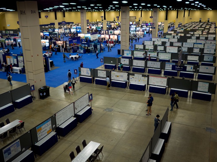
Figure 1: A poster session before the rush! Anyone who attends a poster hall like this should wear a pedometer and very comfortable shoes! Hard floors, exhausting and almost impossible to find anyone.
We’ve been thinking about ways to make posters more effective, and the behaviours that make a poster session more rewarding. There are so many interacting elements to this – the poster itself, the room design, the room layout and even the presence/absence of refreshments.
‘We need to talk about posters’. Look at Figure 1 again. How many words on a typical poster there? We guesstimate about 500-1000 words per poster. There are several thousand posters in that meeting, which means that that room could have delivered several million words. We posit that of those posters, virtually none of them will be read fully. Nobody really wants to know if you used 3mM or 6mM of a particular reagent, so why add it? - if they really needed to know, they’ll find you and ask you. Posters are not research papers or thesis chapters, they are visual communication opportunities, and they should be eye catching, colourful and concentrate on the most important messages.
We’ve discussed this and agreed to limit all our posters to about 200 words (including title and affiliation) and they seem to be much better, as we concentrate on the visual elements. But, can we make them even more appealing and effective?
In spring 2019, our attention was drawn to this YouTube video (www.youtube.com/watch?v=1RwJbhkCA58) and we realised that there are other interesting solutions out there. This video proposes a bold and imaginative solution, and we’d love to see if it works for our subject areas as well. The video itself is a little slow to develop, but the ideas are readily absorbed, and to our minds, easily adopted. Watch out for posters from CPR over the next few months (especially BMSS Manchester this September), while we put this to the test, and tell us what you think. Why not go further, have a look at the video, and think about how this might work – this is directed at poster presenters and their supervisors alike. You may experience some pushback from those who only think about traditional posters, but stick with it, and you may be at the vanguard of a small but effective revolution! This is what ‘poster 2.0’ might look like after a reboot.
- • A plain language summary of the key conclusion(s) in a huge part of the poster
- • A QR code (linking to a web page, full preprint/poster or similar)
- • An ‘ammo’ bar (the information/data/methods) e.g. on the left
- • A ‘silent presenter’ bar e.g. on the right– a summary of the poster for quick reading
Look at the example in Figure 2, taken from the video
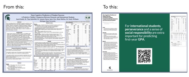
Figure 2. Reducing a poster to an eye catching, plain language, informative punchline, backed up by summaries and data, with a QR link for further information.
Would you be brave enough to do this? In CPR we’re experimenting, and we hope to put some examples on display in BPSR in July and BMSS in September – it would be great if most of the posters were like this! We could really change the way in which we create impact in our posters. The big punchline really makes people stop, and even if they don’t, they get the message.
What is a QR code?
A QR (‘quick response’) code is a 2-dimensional bar code that is often used to link to a web page. Thus, this QR code links to our web page. How can you access this though? The easiest way is to use the inbuilt QR code reader on your phone or other portable device (both iOS and Android). For example, in iOS 11 and later, simply open the camera app, point the camera at the QR code, and you’ll be given an option to be taken directly to the web site. (You could also install QR code reading apps, but beware that some of these sneakily add a monthly subscription – this should not be needed.)
Try it – this QR code points to the CPR web site.
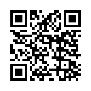
CPR's QR code
You make a QR code by going to one of the free QR code generators that are on-line. The QR code below takes you to a code generator (if you compare them, you’ll see that they look superficially similar, but are different)
And presenters, stop being so passive! You put a lot of effort into the science, and the poster. You have every right to stop passers-by and say ‘can I have a minute to show you my work’, or walk up to one of the ‘big shots’ – (they’re not really big shots, they’re just older, but they share all of your enthusiasm for science!) and say ‘please may I explain my poster’. In virtually every case, you’ll be rewarded by an engaging, knowledgeable, enthusiastic response, and you’ll feel fantastic. Go for it.
Some thoughts for meeting organisers. (We’ve made these mistakes in the past too).
- Give posters time and space – schedule a poster session, don’t jam them in with vendor booths and during lunches and coffees. The poster presenters, predominantly younger, early career scientists, deserve much better.
- Use Odd/even numbering to manage time for presentation and time for viewing. Schedule times for attendance and if you are a presenter, make sure you are there.
- Put the posters in a large enough room that there is space for conversations, people flow, and a chance to step back and take a shot of the QR code.
- Give the poster presenters a big lapel badge to say ‘it’s me!’ and talk to them. Add poster numbers to name badges so poster presenters can be identified easily.
- Supervisors – try to keep a distance form your students and let them go without stabilisers!
- UK in particular, perhaps – STOP forcing portrait format posters – find a way to accommodate landscape posters even if you have to pay a bit more for a room/display boards. (If we have to be portrait, here’s a template for the poster format discussed previously in portrait format (https://osf.io/g6xsm/)
- Don’t ‘herringbone’ (zig-zag) the posters – this creates little zones of deadness where nobody can do anything. Make the posters run linearly.
- Here’s an idea that has also been used. Try to cluster posters on related topics in groups of, say five. Then, ask a convener (perhaps, one of the supervisors) to gather all the five poster presenters together, and do a quick walk around (maybe glass in hand?), where each presenter tells the others briefly about their posters. The five neighbours will find it easy to talk to each other for the rest of the meeting. (One of us has done this as convener in meetings in the past, and it is a super ice breaker, especially for newcomers to an established meeting.)
- Schedule posters early – they are a great way of breaking down shyness and creating a better buzz to the meeting
- Accept electronic posters (ePosters) that complement traditional paper posters, allowing conference attendees to post comments, questions, or share ePosters during and after the conference. It would also help if ePosters could be searched by ‘buzz words’- 5 or so key words selected by the presenter so related topics can be found easily.
- Universal agreement – why do we present posters? Is it to give a summary of a research paper (small figures with walls of text) or is it to engage with passers to entice them over to promote one to one discussion of your work (large colourful figures with little text). Maybe the organisers could be bold enough to set a word limit?
These are not particularly radical thoughts and we’re sure some of them have been tried and tested before, but it would be a brave meeting that considered some of these principles and planned for radically new, lively, poster sessions. We can only say ‘why not try?’.
Disclaimer
These thoughts come from one supervisor and three PhD students, and reflect our opinions only. Our only goal is to try to create some discussion about the whole poster experience. Your opinions may differ.
Footnote
Two more QR codes. LH: the YouTube video, RH: the link to the portrait format